
Basics:
Links Deep Dive
Part 3
Okay, folks – this is the third part of my Deep Dive on Links! So far, in part 1, we talked about how users use links and some email-specific link things to stop doing. In part 2, we discussed formatting your links to meet other accessibility requirements. Today in part 3, we will discuss the text that goes into those links.
I’m going to go ahead and sneak in a plug for Part 4 of my alt text deep dive about functional images.
What does alt text have to do with link text? I’m glad you asked!
From a functional standpoint, the text alternative of a linked image serves the same purpose as regular ol’ link text. That purpose is to tell the user where that link will take them. Obviously, an image’s alt text *also* serves the function of describing the image, it’s not an either/or here, it’s an *and*.
So even though this post will focus on link text, I just wanted to reiterate that whatever criteria we’re meeting with link text must also be met by alternative text on a linked image (aka a functional image).
Link Text Basics
Back in Part 1, we talked about how all users need to find the link and be able to activate the link. We talked about the functional side of that and how different users can do both of those things. Today, we’re taking that info and expanding on it.
One of my visuals for thinking about link text is to think about signage.
When I’m out and about in my neighborhood, I rarely look at the signs around me because I know the area well and where I’m going. But wow – I rented a bike in Boston and attempted to ride in a bike lane on the way to a trail I wanted to ride. I was reading so many signs! I was constantly looking for the green bike arrow to tell me where I was going. I got lost several times and had to keep stopping to reorient myself, and this was with the help of Google Maps. Clearly, these bike lanes were made for and used by cyclists who know how to ride in the city, and I was definitely out of my element! (I had a great time though, and did survive)
My point is that signs don’t feel important until you need them, and I think we tend to overlook link text similarly. We have to treat our link text “signs” as if they are directing new users to our city. We can’t just have a “click here” arrow and assume everyone knows where that sign points us.

No – we need signs that are really clear and easy to understand so we don’t get lost and end up riding our collective bikes into a scary one-way street with honk-happy delivery truck drivers. (I’m fine, it’s fine) Crystal clear signs are the absolute best – telling us exactly where to go to get what we want.

(Look, it’s a few weeks up to Black Friday here, and the thought of going to a loud bar right now is the opposite of what I want to do, but the visuals on the sign are really clear)
Put plainly, the link text needs to communicate what will happen when a user activates that link. Whether downloading a PDF or going to a product page, clear link text is the goal.
Note: We developers can lean a bit literal so I’m going to mention that I’m *not* saying that you should use the actual link destination like the URL. Using the link URL is actually more confusing and ambiguous. Linking “Privacy Policy” is always going to be more clear than linking “website.com/privacy-policy” so back away from the literal interpretations and just be clear about where the link is going.
The WCAG has two different criteria that talk about link text – let’s take a look at these guys:
SC 2.4.4: Link Purpose (In Context) (Level A)
Being “only” a Level A conformance criteria, this is the bare minimum of what *has to* be in your link text. (This is also why all linked images *must* have alt text!)
This conformance criteria is pretty easy to meet – it’s not just the link itself that has to explain where the link goes, but the content around the link can count here, too. And this is where getting deep into the WCAG gets a bit more interesting. If you only read the first paragraph of that WCAG SC, you can imagine a kind of broader target around your links, and so long as your link is visually nearish content that goes with it, you’re good, right?
Well, actually, wrong. I would like to introduce you to a Technique Failure document, F63, which goes into more detail. It’s not enough for the link to be visually nearish content that helps us understand its context.
It actually has to be programmatically connected in some way. It has to be “in the same sentence, paragraph, list item, or table cell as the link.” In another document, Technique H80, we can also use the heading of that link’s content in addition to that link text, which can also be helpful for us email marketers.
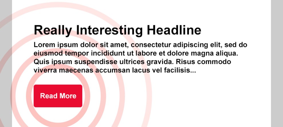
So all that to say, you do have to be aware of how some of these designs need to be coded. If within a table cell, you have a headline in a heading, along with a “Read More” link – you’re meeting both of those solutions’ documentation. Since that’s *usually* how we end up coding these kinds of things, you’ll likely not have to make major changes in how you’re building things to meet this criteria. (Also, designers, note that *usually* is not *always* so talk to your developer to make sure this is how it’s working in your emails)

Just remember, this is still the lowest of the low. Remember that link list we talked about in Part 1? If all of the links in your email say “Read More,” – you’re forcing screen reader users to skim through your entire email to get to the product they want. If you’re like me, I hate it when a subject line talks about a sale on an item I want, and then I have to dig around in the email to find the link for that item. (Ugh) You’re meeting the baseline criteria, but it’s still not great.
SC 2.4.9: Link Purpose (Link Only) (Level AAA)
So from Level A, we jump right to Level AAA, with no Level AA that we can rest our laurels on. From a strictly technical level, if your aim is Level AA, you are okay to meet the previous criteria only because there just isn’t a Level AA to meet. But as I shared above, it’s not a great experience.
SC 2.4.9 is a harder criterion to meet, and we can get ourselves into several technical problems trying to meet it in email, so let’s dig in. 2.4.9 isn’t allowing any context for us at all – that link text needs to be super clear and differentiate itself from other links in the email.
By only reading the link text – the user should be able to know exactly where that link goes and what to expect by activating it. So we’re not doing “Shop Now,” we’re doing “Shop Running Shoes on Sale Now.” Yes, that is an extremely long CTA link, and yes, every email designer that just read that is having an existential crisis. (sorry)
And that really is the goal for this success criteria. Imagine that you don’t know anything about this email except for the one link in front of you – where exactly is that link going, and what makes it different from the other links in your email? Can you use only that link text to determine where that link goes? This is a good time to remember that signage metaphor from earlier – if you’re a stranger in a strange land, is this one sign going to get you where you want to go??

As important as these questions are, there’s an additional question that goes into the linking strategy: where exactly does that link go? *Does* it link to a page with running shoes that are on sale?? If it doesn’t, hi – yes, you are the problem, it’s you. You need descriptive link text that defines where the link actually goes, not where the folks in strategy thought it should go before the web developers informed them that there is no such page.
There’s an undercurrent of organization in all of my higher conformance level discussions, and it belongs here, too – you can’t do this stuff sloppy.
It requires attention to detail and having these details locked down.
That does make last-minute changes harder. You can’t just throw in a new image without adjusting the alt text, and you can’t just throw in a new link without confirming that the link text is still appropriate.
Don’t get too discouraged, though. That is part of what makes it a AAA conformance level.
You can work towards it, or focus on important links and let the others stick to Level A. Or focus on your evergreen links and get those locked down. It’s not a race to perfection; take it one step at a time.
Introducing (again) aria-label!
I didn’t forget my designer friends who are trying to visualize a three-line CTA link! There is hope here, and the WCAG even spells it out for us: Technique ARIA8: Using aria-label for link purpose. This doc tells us that we can use the aria-label attribute to meet either Link Purpose success criteria, but I’ll focus on SC 2.4.9 because it gives us the most breathing room here.
I’ve talked about aria-label before when I dug into whether it was better to use the alt attribute or an aria-label on an image for alternative text. (Not surprised, but alt won!)
So this might seem like I’m just willy-nilly picking and choosing solutions here, so let me dig into this a bit more. The alt attribute is the semantic solution to give an image its accessible name (what AT calls that element). There’s no reason to change anything about that because the alt attribute does this job perfectly without it confusing or complicating other users’ experiences.
I can’t imagine having my dyslexic daughter try to read a three-line CTA link – she’d give up! (Though she does not give up, that girl is fierce)
When we use an aria-label on a text link, we are making the act of reading that text link easier on users who can more easily understand where that link is headed based on visual cues while also better describing that link destination to those who can’t access those visual cues as well or at all. It’s a bit of a “best of both worlds” solution – folks who have a harder time reading the text will lean into the visual context; folks who can’t see the visual context will get the extra info they need to activate the right link.
When we use aria-label in text links, it’s important to know that the aria-label is read and *not* the link text.
(Sigh, there is one combo of an email client and a screen reader that did read both, but again, that is a failure of the email client, not our code. There are also a few email clients that just won’t read that aria-label, like Yahoo mail, which is again a failure. You can find those aria-label results here.)
That means it’s important that we include all of the content we want to be read in the aria-label, like this:
Shop Now
So in the above case, screen readers will read, “Shop Running Shoes on Sale Now, link.”
Note: Just like we shouldn’t add “Image of” to our alt attributes, we also don’t need to declare our links as links. The screen reader (or other AT) does this for us, and explaining the document’s structure is a key component of their purpose. It’s also why we use semantic solutions as much as possible – to align with the expected standardization that AT relies on to do its job. (so in the above readout, the “, link” was added by the screen reader.)
But wait! Isn’t it bad when the screen reader and visual content don’t match up? Not exactly – that specific issue is related to other situations where the accessible name is incorrect or doesn’t follow the expected flow of content in the page. We are enhancing this experience more than we are confusing it.
That said, I think there is a valid argument for not using the aria-label here and instead sticking with solid link text that works for everyone, but it is a balancing act. Is it possible to be absolutely clear with fewer words? Almost certainly, I am not a copywriter and I’d bet there’s a handful of copywriters that would love to finesse link text so it’s clearer for everyone. (Hire them!)
Speaking of copywriters – guys, I’m sorry. I really stink at words. I try, but both my “Read more” and “Shop Now” CTA’s are super lame and I’m very aware of that. If you’d like to show off your chops and give us some good CTA text – feel free to share this post on LinkedIn with some way better text and, if you mention me, I’ll totally tell you how much better of a writer than me you are. (It is a low bar, but hey) Just be sure to note if you’re following the Level A conformance or Level AA!
It is a relief to know that we have a good solution to use in those times when we have different goalposts that might want a shorter CTA *and* accessible emails. Just again – make sure that you have a plan for managing those aria-labels when/if changes come up.
So that’s the gist of descriptive link text – if you have any follow-up questions, I am still taking questions on my Q&A form.
Next week I’m doing a part 4 that’s more focused on linking strategy, which reduces some of the head-scratchers of link text and makes everyone’s experience – from creator to recipient – a little easier.