
Component:
CTA/Buttons
Please note: In the web world, the debate over buttons vs. links has long been fought and won. In email marketing, the word “button” continues to mean “pretty link” and not *usually* a functional button that initiates an action or script. For that reason – I have started using CTA or Call to Action link.
There are few things as confounding in email development as the CTA link. Historically, getting anything other than an image to render has had considerable challenges. Many email developers have spent hours tweaking their code to get a CTA link to visually render across as many supported email clients as possible.
Until fairly recently, very little consideration was given to creating an accessible CTA link. So let’s break it down into the main items I look for when scoping out a CTA link.
What makes up an accessible email CTA?
- Color Contrast (WCAG SC 1.4.3)
Just like any other link, there has to be appropriate color contrast between the link text, the CTA color, AND the email’s background color. I found this handy visual editor to show you the different parts of the CTA and whether or not they meet color contrast requirements: https://buttonbuddy.dev/ (Please note this is specifically talking about web buttons, but the color contrast requirements are still useful here) - Physical Size / Clickable Area (WCAG 2.5.8)
In order to support users with mobility impairments and users with low vision, it’s important that any clickable elements on the page are at least a 24 x 24 CSS pixels square. This means that the clickable space on a CTA needs to be at least 24px tall and anywhere that looks like part of the CTA should also be clickable. This is important because many email CTA options change size in different email clients – largely Outlook. The CTA needs to meet this requirement in EVERY supported email client. This success criteria is new to the 2.2 version of the WCAG and is the first Level AA conformance criteria that discusses physical size. Previously, the only SC criteria that discussed physical size was Level AAA conformance, (WCAG 2.5.5) which caused a bit of a challenge for creators. The physical dimensions for that criteria had to be at least a 44px x 44px, which I think is still a good dimension to try for with CTA links. And it’s not enough for it to just have a functional clickable space, anything that looks like part of that CTA should be clickable too. So left to right, top to bottom, everything that looks like a “button” should activate the link when clicked.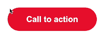
- Readout (WCAG SC 1.1.1 and SC 2.4.4)
The CTA needs to be read by a screen reader like a regular text link, because it is a text link. Anything else is likely going to result in a failure. This is part of what gets us into trouble with VML Buttons, they do not read like normal links and that can cause considerable confusion. - Tabable / Link list (WCAG SC 2.1.1)
The CTA needs to show up in the screen reader link list and to be tabable. This means that the user can use the tab key (or k key of VO+command+L for dumb Apple Mail) to navigate to each link. Depending on the email client and assistive technology, the specifics of how this works may vary. When I’m testing a new CTA style, I will also include a standard text link so I have a direct comparison in my tests. - Function (WCAG SC 2.1.1)
The CTA needs to function like a link – when you click on it, the link needs to populate in a new window. When you tab to the link and hit enter, the link needs to populate in a new window as well. This is expected functionality for email links. If the link doesn’t work like any other text link that is likely a failure. - Live Text (WCAG SC 1.4.5)
There is universal need for CTA links to be live text. This opens the door for considerable efficiencies. An image based CTA link is incredibly cumbersome – minor text changes require a designer to make the adjustment, resize, export, upload, etc. Live text allows for infinite last minute changes, language changes, dynamic content, etc. It also allows for low-vision users that use magnification to see crystal-clear text instead of a blurry mess. - Render
Because we’re talking about email, it does need to render across supported email clients. This usually gets us into trouble with – you guessed it – Outlook on PC’s. If you are more focused on rendering than accessibility, you tend to have less accessible buttons. If your email goals include accessibility, you’re likely going to have less perfect rendering on your buttons. Until someone finds a solution that meets all of these criteria perfectly, we remain stuck choosing between the two. - Link Text (WCAG SC 2.4.4 and 2.4.9)
There are two different WCAG Success Criteria that discuss link text and the difference here comes down to which conformance level you are working towards. 2.4.4. is Level A and it supports link text in context, which means that you can have text that says “Shop Now,” so long as the other content surrounding it helps you know what you’re shopping for. At Level AAA, SC 2.4.9 – which is more strict – requires the link text to be clear on its own without any context clues. So that “Shop Now” would need to be more specific, like “Shop Clearance Running Shoes Now.” This is a great time to use the aria-label property which is read instead of the link text and is only read by assistive technologies. This means you can tailor your aria-label to explain more about that CTA link without having an extremely long visual link text. Because this is Level AAA, you don’t have to wear yourself out trying to make this work, but if it’s something you can easily implement, I think it’s worth doing. (I’ve got another post coming that will go into more detail about link text, don’t worry!)
Other things we like to have in a good email CTA:
- ability to change width/alignment in mobile
- ability to have a flexible width OR a set width
- ability for the CTA to have multiple lines without looking too weird
Best Accessible CTA Code Snippets:
Padding Style CTA:
Shop Now When we use the padding style button, we are essentially just beefing up a text link with a background color and padding. These are great because they work easily without a lot of bulky code. The downside is that Outlook really doesn’t translate these buttons very well. Outlook considerably shrinks padded buttons, making the CTA smaller than the physical dimensions to be accessible. Outlook will also get rid of additional formatting such as a border radius.
Pros
- Super simple, no bulky code
- Renders well on nearly every email client
Cons
- Major issues with Outlook on PCs
- Doesn’t support fixed widths
Image-Based CTA:

This solution makes me groan, but it actually meets most of the criteria – assuming you’re writing appropriate alt text and using retina images! The downside is that any minor change to this CTA is going to require working it into Photoshop and hosting a new image, meaning this button type can’t really work with dynamic content and can really slow you down.
Pros
- Very simple code
- Renders perfectly
- Supports fixed widths
Cons
- Is not live text, depends on alt text for accessible content
- Is not scalable
Note: I did not include the aria-label in the image based button example because in this case, the alt text is doing that job already. It would be redundant to have both here, and honestly kinda silly and prone to error. Also – again – note that the aria-label is only required if you are going for that AAA conformance (see #8)
Table-assisted Padding Style CTA:
Shop Now
This is a padding-style button wrapped in a table that visually supports Outlook. This works well across different uses – longer CTA text easily wraps to another line – allowing for fool-proof implementation on dynamic email campaigns where you don’t always know what that text is going to say, or in what language it will be in. The code itself is pretty straightforward, which means that non-coders can easily make updates to it without too much trouble. However, it does not always work well in dark mode and the physical size/ clickable area is still impacted in Outlook. This CTA will look better in Outlook, but may frustrate some users because the outer button area is not clickable. Even with its flaws, this is what I use for clients that aren’t quite ready to go full padding/border (naked) in Outlook.
Pros
- Somewhat more complicated code
- Renders well on every email client
- Supports fixed widths
Cons
- Confuses Outlook users – CTA looks clickable but only a portion of it is
- Too much code for what it is
*Because it meets some of this criteria but not quite all, it gets an orange instead of red.
MSO/I-style CTA:
Shop NowThis is a great solution and renders really well *and* is entirely clickable. It meets all of our criteria for an accessible CTA link! My biggest hesitation is that it is a bit more complicated, which might make it a bit harder to implement if your process includes non-coders or frequent changes/adjustments. I did have some minor rendering issues with more specific code examples: when a CTA jumped to two lines in PC Outlook it was not pretty; and it wouldn’t keep forced widths in Outlook either. Definitely a more accessible CTA and if you’re able to live within those (totally reasonable) limitations this is a good solution. You can find out more about this CTA type from Mark Robbins at ReallyGoodEmailCode.com.
Pros
- Renders extremely well
- Meets all accessibility criteria
Cons
- Fairly complicated code
- Needs higher level coder if unfamiliar
- Doesn’t support fixed widths
- Looks bad when breaks to two lines
Border-Style CTA:
Shop NowI had almost forgotten about this CTA style as I had largely stopped using it due to dark mode color problems- those still exist but I still think this is a good CTA solution. It works similarly to the padding-style CTA, but the borders hold up better in Outlook, making this a somewhat more accessible solution than the padding-style CTA on it’s own. Because all of the CTA color that you see is clickable, you won’t confuse anyone by having space that looks like it should click, but doesn’t. This is also less complicated coding-wise so you don’t have to worry as much about less experienced devs on your team.
Pros
- Renders better than padding-style
- Meets all accessibility criteria
- When CTA breaks to a second line, the CTA still looks good.
Cons
- Colors don’t look great in dark mode
- Border radius doesn’t work in Outlook
- Doesn’t support fixed widths
Wondering why a “bulletproof button” isn’t on this list? Read about my findings on VML.
Why don’t I have any roles on these CTA links? Because we are using the a tag semantically, as it is meant to be used. We should *only* apply a role attribute to elements when we are using them in ways that are not expected for that element. Example: We apply the role="presentation" to our layout tables because tables should not be used for layout and the presentation role helps assistive technologies determine how to read the code. The role="button" attribute should not be used in any CTA links in emails because these are links, not buttons.
I hope to update this as new CTA types come along. If you have any CTA types that you think should be on this list, please let me know.