
Basics
Links Deep Dive
Part 1
After the (entirely unexpected) success of my alternative text series, I figured I’d see what other items in our collective email tool chest could use a deep dive. And lo and behold, links are in real need of a once-over. This is also going to be a multi-parter so get used to thinking more about links than you’d like to!
Links (technically hyperlinks) are the foundation of the internet. In its simplest form, a link is already accessible. You’d think that would mean that we wouldn’t have to think that much about them, but you’d be wrong. There are a number of things we need to consider when creating links for our emails, but before we dive into all that, let’s talk about how different users use links.
Every user has to be able to find and navigate to the link, and then activate the link to be transported to whatever the destination of that link is. Mouse users click the link, mobile users tap the link, and keyboard users activate the link by clicking the Enter key or Space bar. Other assistive technologies have ways to activate a link too, depending on the interface used. If you’re interested in seeing how people use different assistive technologies, I found this Youtube playlist that showcases different users using their AT.

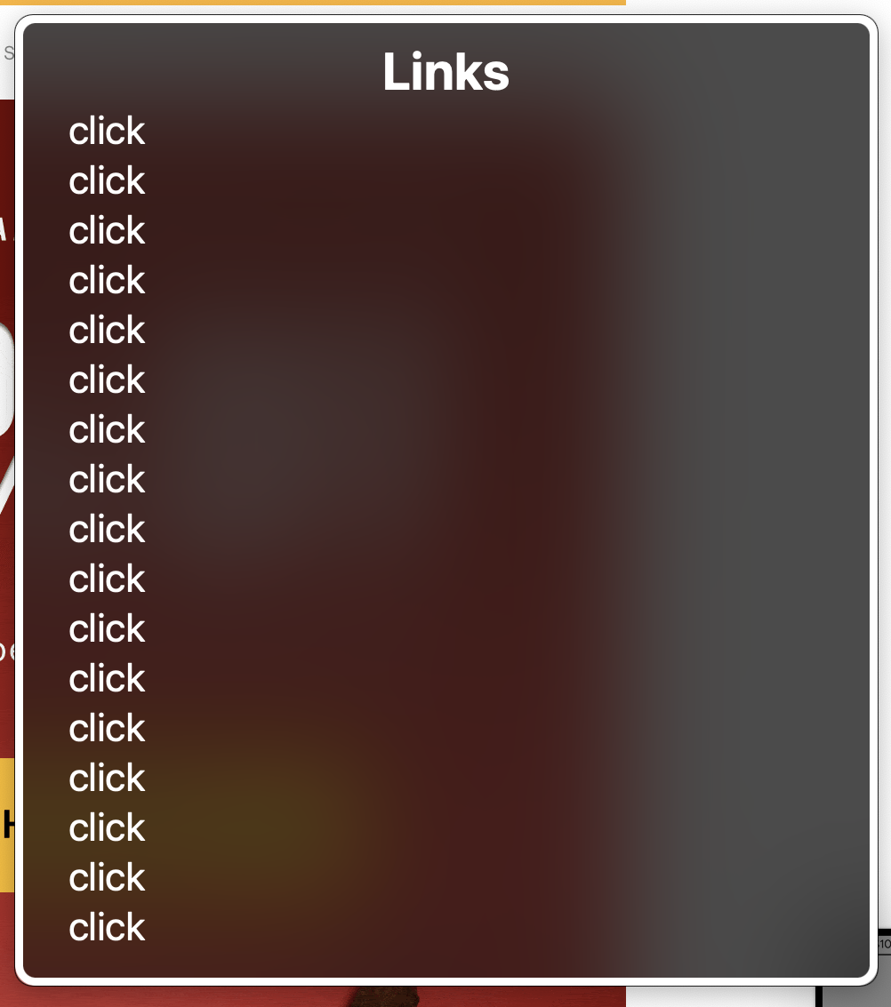
Most assistive technologies have specialized solutions for their users to help them navigate the digital world in faster and more efficient ways. Many assistive technologies have a way to pull up a modal box that will list all of the links on a page, sometimes that list can be organized in different ways such as alphabetically or in its page order. AT users can also skip from link to link, like when a keyboard user taps the tab key. You can try tabbing between links on your emails and browsers too, no special tools required, other than a keyboard.
Part of what makes links accessible is that they are totally standardized. A simple link will look something like this: Link Text Because of that standardizing, every link you come across should function the same way. That’s part of how assistive technologies are able to build so much functionality around links.
However, we still work in email and I’m sure that you are thinking about all the different and not ideal situations where we use an tag that doesn’t actually fit the above example or otherwise strays from the norm a bit. Let’s break down these common offenders:
- Using an empty link to style text that is auto-formatted by email clients. Here’s an example:
123-456-7890
I did a quick Google search and this is still a suggested solution in many trusted email coding sources. 🙂 It is a bit of an old solution and I’m happy to see that when it is listed it’s usually near the end in a “I mean, I guess if you really have to,” kinda way.
So, it has been written before but these blue links are worthwhile and useful for the people actually interacting with your emails, so please just stop with the overriding. Or better yet, link them yourself to make sure that the color contrast ratios are being met and that it is visually distinguishable from other content, ie. underlined. - Links that are supposed to work, but don’t. Local anchors are a good example of that. I feel like this is pretty straightforward, but if it is a link that doesn’t work like a link, that’s not just a coding failure, it’s also an accessibility failure. This rule also applies to other weird coding solutions, like linking an entire table (which stopped working well a long time ago, though I caught one of these in the wild that somehow caused a keyboard trap).
And again, if it is linked but does not work like a link, that is an accessibility failure.
- Having too many links to the same destination. I talked about this a bit in the Product Stack article, but having multiple links that go to the same destination is redundant and annoying. It also creates a bunch of accidental clicks and fills up that link list with the same link. That’s right, every single one of those a tags creates a new link in that list. So if you’re linking the product image, product name, product description, and the product CTA, you’ve already taken up 4 lines on that link list. Ugh. Here’s a hilarious link window in the wild that is *super helpful* – question: which link would you choose?
So, similarly to the first part of my alt text series, the first part of my link series is “Just do it right, no funny business.” Now we know that if we’re adding a link to an email, we’re not doing anything goofy, we’re just using that tag with an href that goes to a proper destination URL. We’re not linking to the same link multiple times, we’re keeping it simple and linking the way assistive technologies expect us to.
In Part 2, we’ll talk about some of the specific accessibility criteria we have to consider when we are using links.